 Tattoo Stencil
 Buy me a coffee
Design collection
Tattoo Stencils
Browse tattoo stencils by subject and style. Compare the shapes, line details, and paper proofs that can help you choose a design.
Featured tattoo stencils
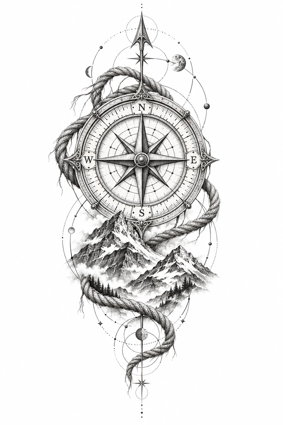
Geometric
Compass Tattoo
An engraved compass rose framed by alpine peaks, knotted rope, and celestial orbits.
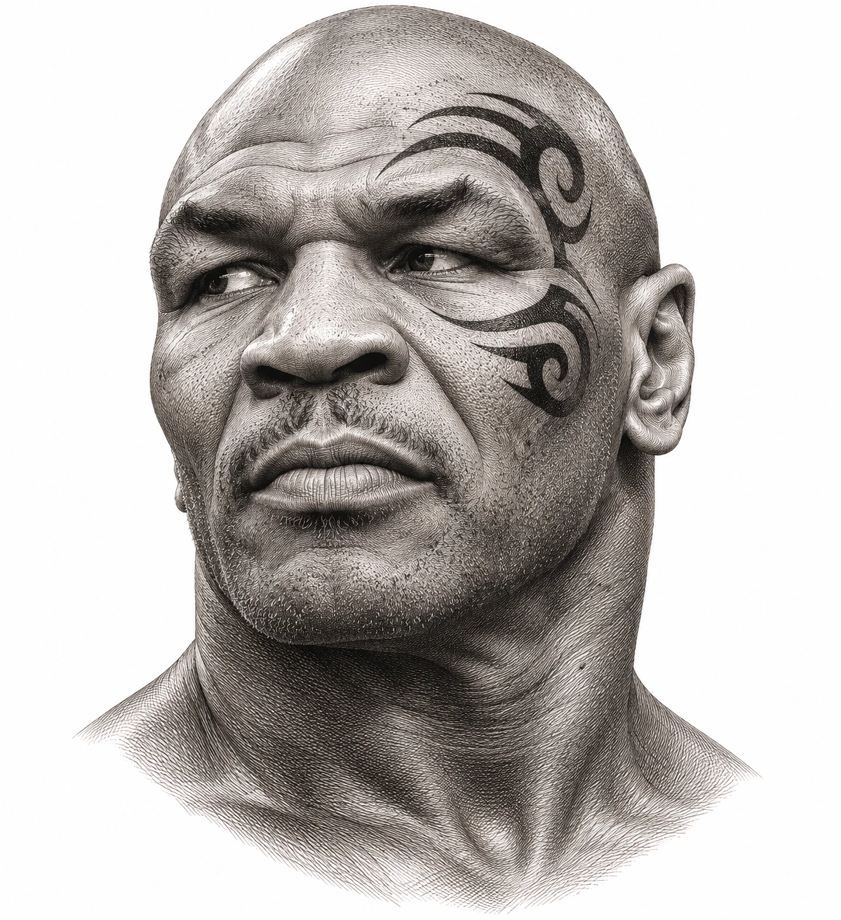
Tattoo History
Mike Tyson Tattoo
The curved black design Victor Whitmill tattooed around Mike Tyson’s left eye in 2003.
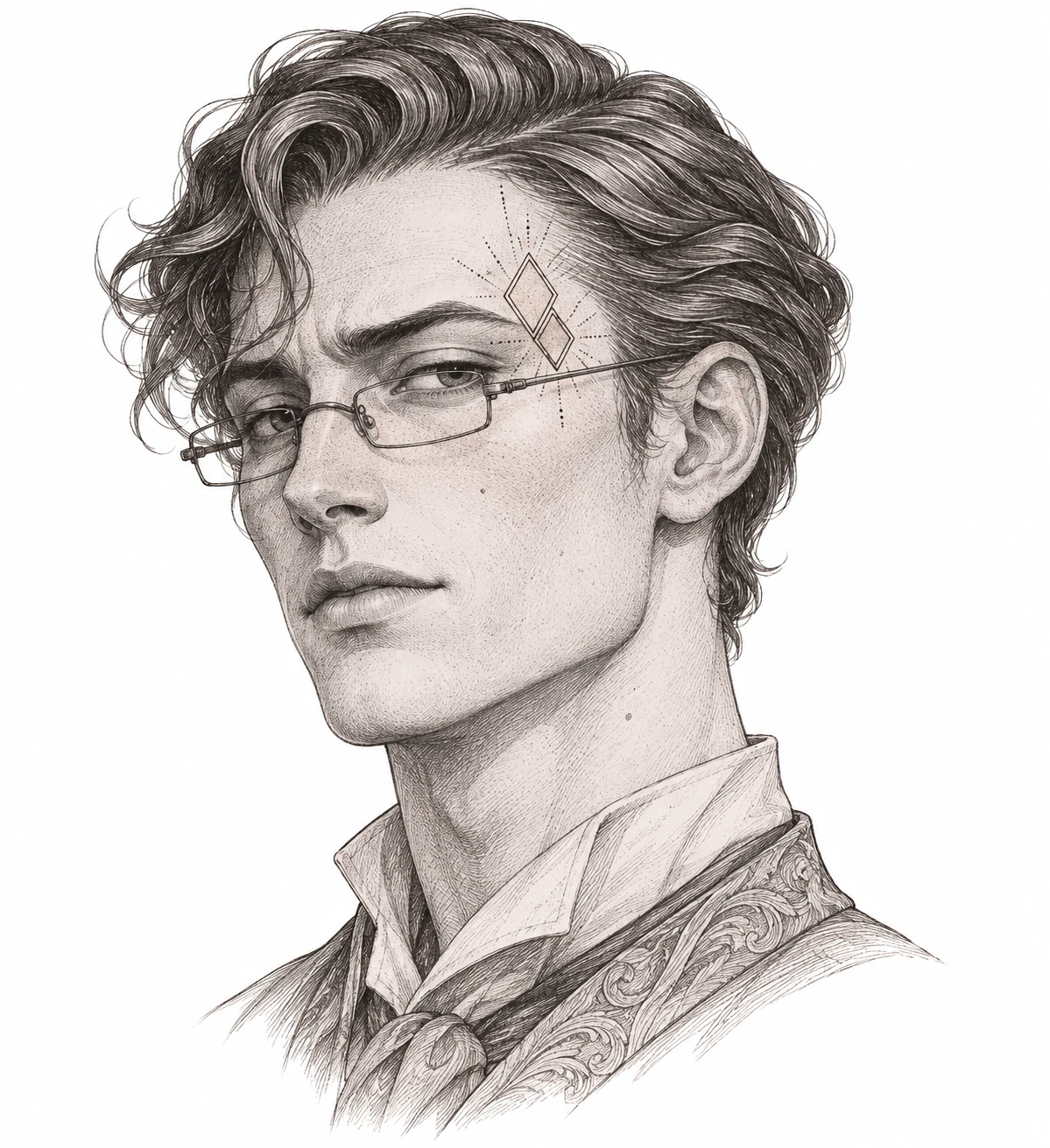
Portrait
Stu Tattoo
A fine-line temple placement study inspired by Stu Price in The Hangover Part II.
Choose tattoo stencils by shape
Begin with the silhouette and the space you have to work with. Mark the approximate width and height on a sheet of paper and decide where the long edge should go. A slender stem, a pair of spread wings, and a circular emblem use that area differently. Each category card opens a set of visual references, so you can compare the shapes side by side and open an individual design when you want to see its source and paper-proof notes.
If you already have a subject in mind, start with one of the subject collections. For example, compare a single bloom with a stem or branch if you want a botanical design with a clear direction. If the mark-making is more important, start with a style collection and look for a subject that suits it. A large dark shape and a lightly outlined design can look similar at thumbnail size while requiring very different treatment in the working draft. Open both designs before making a choice.
Look for the detail that makes a design recognizable
On a floral reference, find the petal edge or the curve of the stem that carries the shape. On a butterfly, check the join between the wings and body, then look at the markings inside the wings. For a radial design, use the center and the spacing between repeated lines. On a dark silhouette, the openings between the dark areas can be the feature that shows where a wing, leaf, or bend begins. Mark the essential feature in your notes before you compare a reduced copy.
A useful comparison keeps the size the same while changing one detail. For example, compare a draft with all of the inside lines to one with a few less important lines removed. Look at both from the same distance on plain paper. If the simpler draft still reads clearly, keep the original as a tonal reference and label the draft as a simplified version. If you lose the feature that identifies the subject, restore that line and try increasing the space around it instead.
Compare a subject collection with a style collection
You can use the navigation in either direction. A design from a subject group may also appear in a style group because the collections answer different questions. Open the rose selection to compare different bloom and stem shapes, then open the fine line selection to compare how narrow gaps are used across flowers, wings, and a profile. Use the related links on individual design pages to see what else shares the characteristic you want to explore.
Take notes on the relationship you want to preserve. You might want a design that follows a diagonal, or one whose main shape stays centered while the ornaments extend to either side. A different design of the same subject may fit better than scaling the first one down. Keep a paper copy of both when the decision depends on their footprint. This gives you a specific comparison to discuss during a consultation.
Prepare a draft for a real-size comparison
The artwork on these pages serves as a design reference. Read the source information for each image before reusing it. For your own image or an image you have permission to process, open the stencil maker and compare its linework preview with the original. Use the pen or eraser for a local adjustment when the rest of the draft is already close. Enter the physical size after you decide which details to keep. The printable PDF is useful when the size of the paper proof matters, and the PNG is useful for sharing or further editing.
Choose the paper that is loaded in the printer, then open the PDF and print the calibration sheet at Actual Size or one hundred percent. Measure the line with a ruler. A correctly measured print lets you judge the design instead of guessing whether the viewer scaled it. If the draft covers several sheets, align the overlapping marks before comparing the overall size. Use a plain-paper copy to check direction and bring the reference, the chosen proof, and its measured dimensions when discussing the next step with an artist.
When you save a shortlist, record which size, direction, and source each draft uses. This is particularly useful when two references differ only in a small detail. Keep the artwork file with the PDF and use a new filename after making a revision. The next time you look at the drawings you will be able to tell which version was intended for comparison and which one was prepared for printing.
Diagnose the first print that looks wrong
If the whole design is smaller than expected, measure the calibration line before touching the artwork. A short calibration line points to a print setting. Check for Fit to Page in the viewer, and confirm that the paper loaded in the printer matches the selected format. If the calibration line is correct, compare the outline you can see with the dimensions you entered. Blank space inside the source image can make the visible artwork take up less than the width of the exported drawing. Check the artwork bounds before preparing another proof.
If the size is correct but thin lines disappear, print a second copy of the same draft and compare it against the preview at the same scale. On a botanical design, inspect the first petal overlap that disappears. On a butterfly, compare the outline of the wing and the markings nearest the body separately. On a dark silhouette, look for the light gaps that divide large shapes. Mark the exact place where the two versions differ. That tells you which local detail to simplify, reopen, or leave in the original reference for the artist to review.
If the paper copy faces the wrong way, pick a feature that makes the two directions easy to distinguish. A compass letter, a curved stem, or the high wing in a flight study works well. Compare that feature against the original and label the paper copy. If only part of a larger design appears in the print, check the sheet count and lay out all the pages before deciding that part of the artwork was cropped. Compare the repeated detail in the overlap first, then measure the full design again.
Keep the failed proof if you can point to a specific problem on it. Put it beside the corrected copy and note the one setting or detail you changed. A labeled pair is especially useful when you are comparing several designs or asking another person to print the file. They can reproduce the version you want by using the same dimensions, paper, and direction.