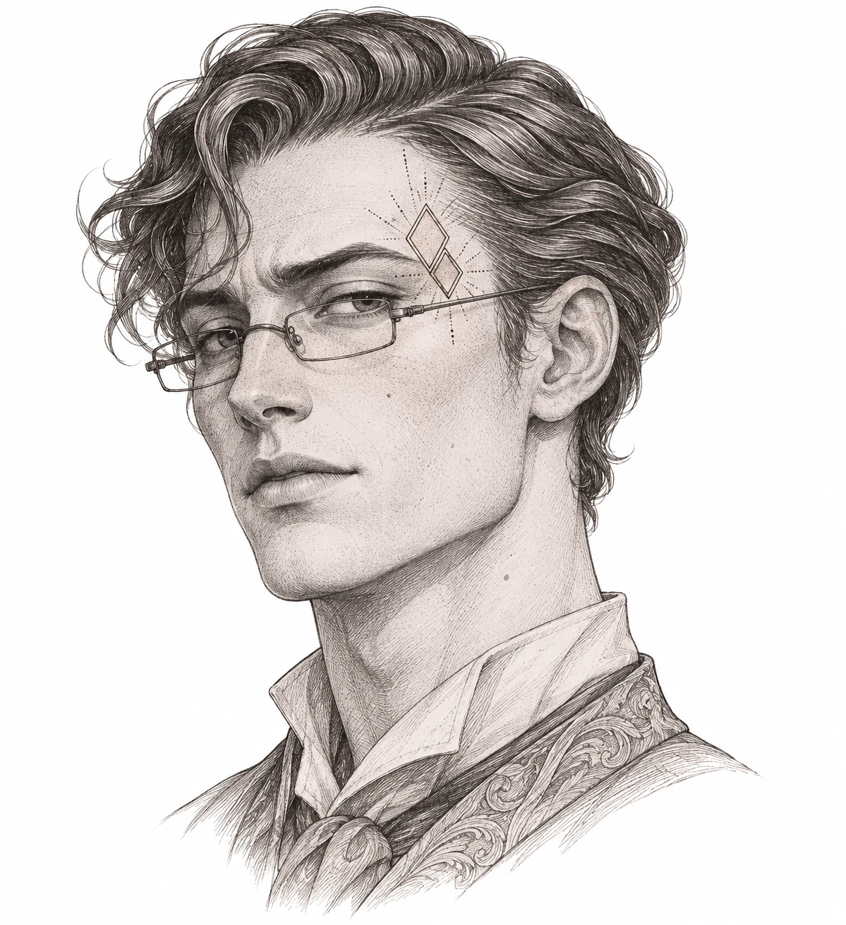
Motif background
The pop-culture reference is Stu Price in The Hangover Part II. Whitmill’s complaint includes the film’s poster and places the character’s mark on the upper left side of the face. The model and open diamonds in this illustration belong to a fictional placement study. The geometric motif is specific to this study.
Whitmill court filing with the film poster
Placement to compare
On a portrait mockup, move the diamonds toward and away from the glasses. Check where the dotted rays sit relative to the temple and how much open space separates them from the frames.
Linework and shading to discuss with your artist
In a consultation about an original design, show the artist both the continuous diamond edges and the dotted accents. Decide together which of the small marks are essential to the silhouette.
Needle grouping terminology from Cheyenne
Compare the geometric motif with the glasses
This page presents an invented temple motif in a film-inspired portrait study. The glasses are part of the composition because they give the geometric mark a visible baseline. A crop that isolates the diamonds may make the pattern look more spacious than it does beside the frames. On a copy of the portrait, try masking the outer dotted rays, then compare how the two versions balance against the glasses. The difference will help you decide whether the rays add a sense of direction or whether the inner diamonds already provide it.
Compare it with the Ornamental Profile for a quieter accent or with the credited Mike Tyson reference to see the effect of a heavier silhouette near an eye. The distinguishing feature here is the alternation of straight diamond edges and small isolated marks. If you want to use that relationship as a starting point for a separate sketch, compare a version that pulls the dots away from the diamonds with a version that shortens the rays. Keeping the portrait beside both sketches makes changes in visual weight easier to judge.
Compare the shape at the size you plan to use
Use the top edge of the glasses as the baseline for this fictional temple study. Mark the frame corner and the height of the two outermost dots on the paper. Compare two copies with the same frame size and change only the scale of the ornament. This shows whether the mark fits the space above the glasses or only seems to fit after the portrait is scaled down with it. Keep a copy of the full portrait for orientation.
A comparison checklist for Stu Tattoo
- Use the glasses and the temple outline as fixed points around the invented diamond motif.
- Compare a sparse row of dots with the fuller rays at the same width. Keep a gap above the glasses on both copies.
- Mark which temple the original illustration shows. A reversal changes the relationship between the motif and the frames.
Put tracing paper over the fictional temple illustration and draw a box around just the diamonds. Draw a second box around the complete ornament, including the dotted rays. Compare how much farther the second box extends above and outward from the frame of the glasses. If the rays do most of the work of making the mark feel wide, you can compare a narrower arrangement by moving or omitting an outer dot while keeping the diamond area and its relation to the frames fixed.
Decide which details belong in the linework
Give the long edges of the diamonds a clearer role than the short dotted rays. Look at the narrowest space where two diamonds approach and at the pale gap between the lowest dot and the glasses. If the two kinds of marks compete, test removing an outer dot or shortening a ray while preserving the diamond corners. Keep the glasses outline on the reference but separate it from the decorative drawing so you can see where the two shapes nearly meet.
Keep a recognizable edge of the face in view while comparing the ornament. The relative position of the two matters more than the amount of detail in either shape on its own. Compare the mark against the same feature on both paper sizes so that you can separate a change in placement from a change in scale.
Check a plain-paper print at actual size
At the intended paper size, compare the full dotted rays with a version that leaves the outermost marks out. Look just above the glasses corner without zooming in. If two dots read as a dash, or a low dot looks like part of the frame, mark the exact place on the copy. Increase that local separation or keep the sparser version, then print again at the same scale. Compare the paper studies as independent sketches rather than treating them as copies of the film mark.
On the printer preview, leave enough margin to show the glasses corner and the outside ray. Losing either makes a cropped print hard to compare with the complete portrait. For a large proof that must be tiled, try placing the joint away from the frame and lowest dots. If a joint crosses the rays, check the position of the diamonds against the glasses before judging a dot spacing change. A slight shift in the portrait can otherwise look like a change in the ornament. See the actual-size printing guide for calibration and page alignment.
Keep a record of the direction and the chosen draft
Keep the full portrait and the isolated geometric study together in the handoff. Mark which temple appears in the illustration and name the dotted variants by what they include, such as full rays and reduced outer dots. Record the intended orientation against the glasses corner, where the difference is easy to see. Describe the page as a fictional placement study inspired by the character, and distinguish the page’s own geometry from any film imagery that is being kept separately for context.
 Tattoo Stencil
 Buy me a coffee