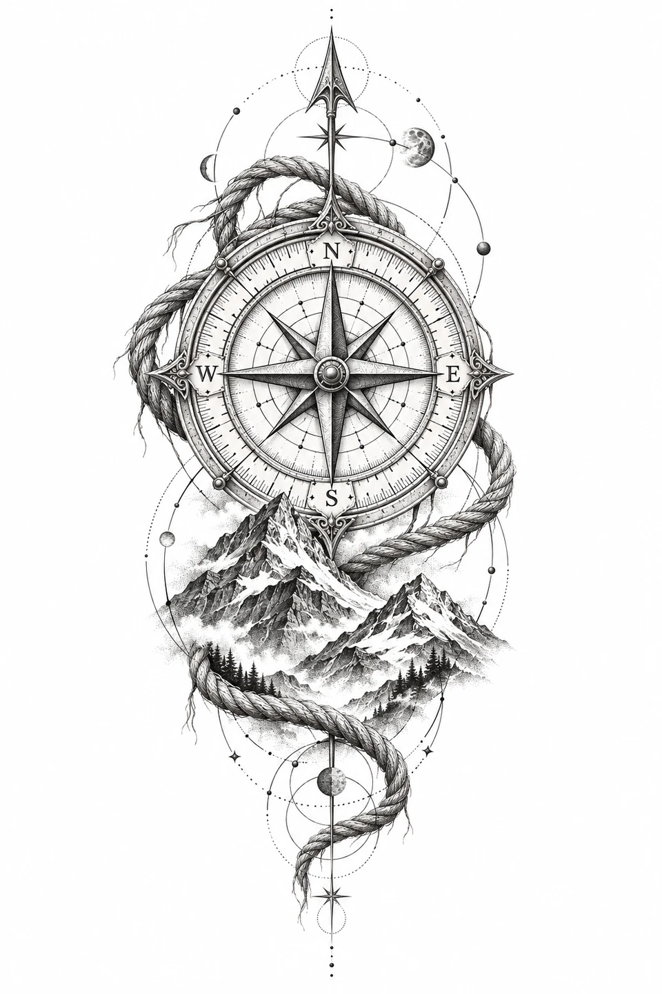
An engraved compass rose framed by alpine peaks, knotted rope, and celestial orbits.
Design notes
The compass rose anchors a tall composition. Keep the dial and its lettering large enough to read, and use the softer mountain shading as a guide for tonal work.
What to check on a paper proof
On a paper mockup, measure the overall height and the width of the dial. The rope and mountain layers make this piece taller than the compass alone. If you are comparing it along a forearm or calf, place the proof lengthwise and check where the dial sits when the paper follows the curve. Compare a second size before committing to a crop.
Read the compass letters and check the gaps between the star points and the surrounding ring. Those are more useful size checks than the mountain shading. If the letters get lost, try a simpler tracing that keeps the dial, the main rope edge, and the outer mountain ridgeline. Use the engraving as a separate tonal reference when reviewing the draft with your artist.
For a draft made from your reference, export a PDF at the measured height. Print the calibration page and both versions at 100%. Check that the letters face the intended direction on the proof, then confirm whether the transfer equipment mirrors the artwork before you set the final output. If the draft takes more than one sheet, align the overlap before judging the dial width.
Artwork source
AI-generated artwork created for Tattoo Stencil and displayed here as a design reference.
The directional dial draws on nautical compass cards. A mariner’s compass in the Royal Museums Greenwich collection places the points of the compass and celestial imagery on the same card. Here the dial, rope, and mountains form an imagined landscape. The museum object gives context for the instrument motif rather than identifying a source for the artwork.
Compare the full composition along the forearm with a dial-only version on the upper arm. Mark which letters are visible in a straight-on view and which begin to wrap out of sight.
Linework and shading to discuss with your artist
Ask the artist which dial divisions need crisp linework and which mountain planes could be kept as shading. Review those decisions at the intended size.
The dial could read as a stand-alone emblem, but the rope and peaks make this version a tall composition with several stops for the eye. Compare it with the Radial Mandala if the measured space is closer to a square. The mandala distributes its detail around a center and gives more equal weight to all sides. The compass uses its ring as a landmark on a vertical path. On a long placement mockup, place the dial where you want the eye to land first, then see whether the rope and ridgeline have enough room to finish above and below it.
A useful tracing decision is whether the rope is a subject or a frame. If the knots matter, retain the strand crossing that makes each knot understandable and reduce redundant rope texture elsewhere. If the compass is the whole point, try a draft with a single rope boundary and fewer mountains rather than reducing every element equally. Keep the engraving beside the draft. It gives the artist a separate reference for which mountain planes are near or distant while the tracing concentrates on the dial and overall arrangement.
Compare the shape at the size you plan to use
Measure this composition from the arrow above the dial to the loose end of the rope below the peaks. On a calf mockup, put the dial on the part you can see straight on and fold the paper around the sides. Check whether the outer ring disappears before the mountains do. If the ring wraps too far around, compare a narrower rope frame at the same dial size. That preserves the lettering better than reducing the dial and frame together.
A comparison checklist for Compass Tattoo
Keep the dial circle, the compass points, and the outline of the rope together in the first draft.
Compare the space between the letters and the dial. Move the mountain hatching to a separate tonal reference if it competes with the dial.
Check the letters against the original before accepting either direction. A plausible-looking dial can still contain reversed lettering.
Compare a dial-first tracing against one that gives the rope and landscape equal weight. At normal reading distance, cover the outside of each proof so only the dial is visible, then uncover the frame. Notice whether the eye still returns to the long compass points or gets pulled toward a dark knot. The small ticks and mountain shading can stay on a separate reference if they obscure that hierarchy. Keep the same dial diameter on both copies so the comparison tests contrast rather than size.
Decide which details belong in the linework
Treat the long compass points and the ring they nearly touch as the first priority. On a tracing, leave the main points stronger than the small ticks. Inspect the pale wedges beside the ends of the points before strengthening any line. Reduce the short hatching inside a dark mountain face first if the composition looks busy. The distinct mountain ridge still identifies that layer, while an extra tick next to a compass letter can make the direction harder to read.
Mark the central axis or point of symmetry in your notes before measuring. Look at the smallest repeating interval in the design. If rings, rays, or arcs nearly touch, compare the same interval at opposite sides of the proof. Keep the spacing consistent when simplifying a repeated element.
Check a plain-paper print at actual size
Print a plain-paper copy at Actual Size and use the calibration line to check the scale. Then read the direction letters without enlarging the page. If a letter touches the dial but the ring measures correctly, circle that letter on the proof and make a version with fewer neighboring ticks. Compare it against the first copy at the same dial width. A change in the calibration measurement calls for a printer correction before you make any change to the lettering.
If a tiled layout puts a seam through the dial, identify a radial point on either side of the joint and check that both aim toward the same center. A rope curve alone is a poor alignment cue because a small shift can still make it look continuous. If the overlap leaves only one readable point, try a layout that keeps the dial on one sheet and lets a mountain or rope segment cross the seam. Check that the top arrow and loose rope end remain within the print margins. See the actual-size printing guide for calibration and page alignment.
Keep a record of the direction and the chosen draft
Write the lettering direction on the paper copy before sending the draft. Include the actual dial diameter as well as the full height, since a narrower frame can change the overall proportions while the dial stays the same. If the rope and mountains were simplified, label that file separately from the full illustration and pair both with the same proof. When the artist opens the handoff, the direction letters and the chosen rope outline should be immediately identifiable without comparing zoom settings.
 Tattoo Stencil
 Buy me a coffee