Motif background
In his 2011 court complaint, S. Victor Whitmill identifies February 10, 2003 as the date he applied the tattoo to the upper left side of Tyson’s face. The filing includes photographs from the session. This page pairs an illustration with a link to the court record so the printed reference can be checked against the original placement.
Whitmill court complaint and session photographs
Placement to compare
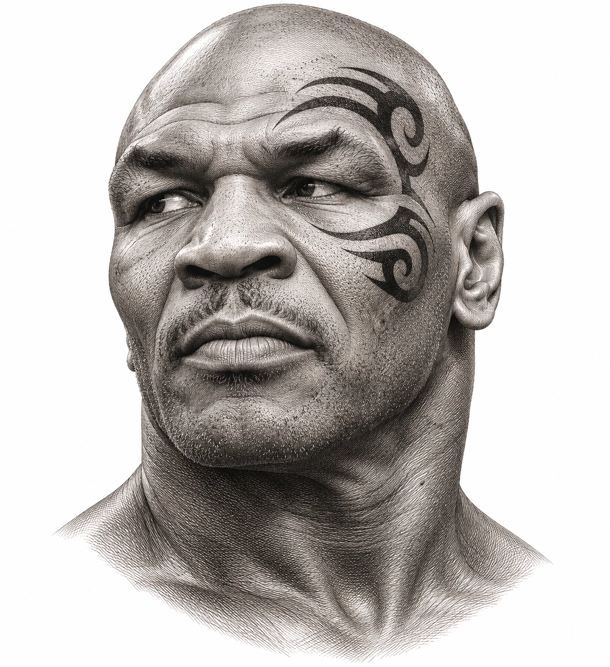
In the photograph, compare the distance between the upper curve and the brow with the distance between the lower curve and the cheekbone. Keeping the face in view makes those relationships easier to read.
Linework and shading to discuss with your artist
For an original design, ask an artist how a strong filled curve can leave a readable opening. The court record establishes the visual reference, while the working needle setup remains undocumented here.
Needle grouping terminology from Cheyenne
Read the portrait and credited photo together
This image is most useful as a placement reference when the surrounding face stays in view. The photograph credited on this page gives you the real relationship between the mark and the features. Start by locating the left eye, then look where each curve runs in relation to the brow and cheek. A tightly cropped tracing would remove those landmarks and make it harder to understand how the two curves frame the eye. Compare the drawing and photograph at roughly the same portrait size before drawing conclusions about how much of the temple the design occupies.
Compare the mark with the Ornamental Profile study to see two different ways an illustration can frame a temple. The small accent in the profile leaves a large area of the face visually quiet. The broad dark strokes in this reference carry much more visual weight across the side of the face. Looking at the two references side by side lets you discuss how far a motif extends and what draws the eye first. That comparison can be useful for a separate design study while keeping this specific artwork and its attribution with the historical reference.
Compare the shape at the size you plan to use
Keep the surrounding face in the paper comparison and align the eyes in the illustration and the credited photograph. Use the brow and cheekbone as landmarks when you compare the reach of the two curves. Scaling the crop around only the black mark can make the upper curl look closer to the eye than it appears in the portrait. A larger paper copy can reveal that relationship without implying that the historical mark has a prescribed physical size.
A comparison checklist for Mike Tyson Tattoo
- Trace the two spiral curves in relation to the eyebrow and cheekbone in the credited image.
- Compare the inner openings of both spirals. The openings distinguish the ends from the broader black strokes.
- Label the reference side of the face on the paper copy. Keep the photo credit with any comparison you show.
Compare the illustration and the credited photograph in two passes. First use the whole face to judge where the curves sit around the left eye. Then inspect the pale openings inside the curves with the rest of the picture still available for reference. A close crop is useful for seeing those openings, but it can make a curve appear to occupy more of the face than it does in the portrait. Keep any notes about a shading difference separate from notes about the placement of the mark.
Decide which details belong in the linework
Compare the dark edges of the mark with the nearby shadows in the portrait. The inner opening of a spiral and the pale area beside the eye are distinct visual boundaries. If you make a paper tracing for analysis, keep the spiral opening clear and leave the brow wrinkles and cheek shading on the portrait reference. That makes it easier to compare the broad curve with the credited photo without mistaking the illustrator’s shading for an edge of the tattoo.
Keep the credited source open next to the illustration. Note the parts of the composition that follow the visible reference and the parts that are interpretive. You can use a paper study to compare scale and direction. Keep that reference credit with your notes if you share the comparison.
Check a plain-paper print at actual size
Set the credited photo next to a plain-paper copy of the portrait and mark the subject’s left side on both. Follow the lower curl until it turns back toward the cheekbone. If the white center of that curl disappears in the print, check it against the same area in the photo before interpreting the shape. A closer paper crop at a larger scale can make the opening visible while the complete portrait remains the reference for placement and direction.
A single sheet is easier to interpret for this reference because the eye and both curls can be seen in one view. If the enlarged study needs two sheets, aim to keep the eye, temple and cheekbone on the same sheet. A seam through the brow can make the upper curve look shifted relative to the eye even when the dark edge itself seems to align. If the printer clips the side of the face, reduce the paper crop or adjust the layout before comparing it with the credited photograph. See the actual-size printing guide for calibration and page alignment.
Keep a record of the direction and the chosen draft
Label the historical reference with the subject’s left side and retain the citation with any crop. If a separate version isolates the curves for visual analysis, name it as a study and keep the full portrait next to it. The artist reviewing the file can then tell which image provides the placement evidence and which is only a tracing. Keep the original photo orientation in the record even when experimenting with a reversed illustration, and mark any reversal on the file itself.
 Tattoo Stencil
 Buy me a coffee