 Tattoo Stencil
 Buy me a coffee
Stencil collection
Portrait and Placement Studies
Compare an ornamental profile with the Mike Tyson and Stu placement references.
3 designs
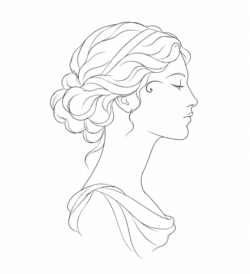
Portrait
Ornamental Profile
An anonymous profile with a small decorative curve near the temple.
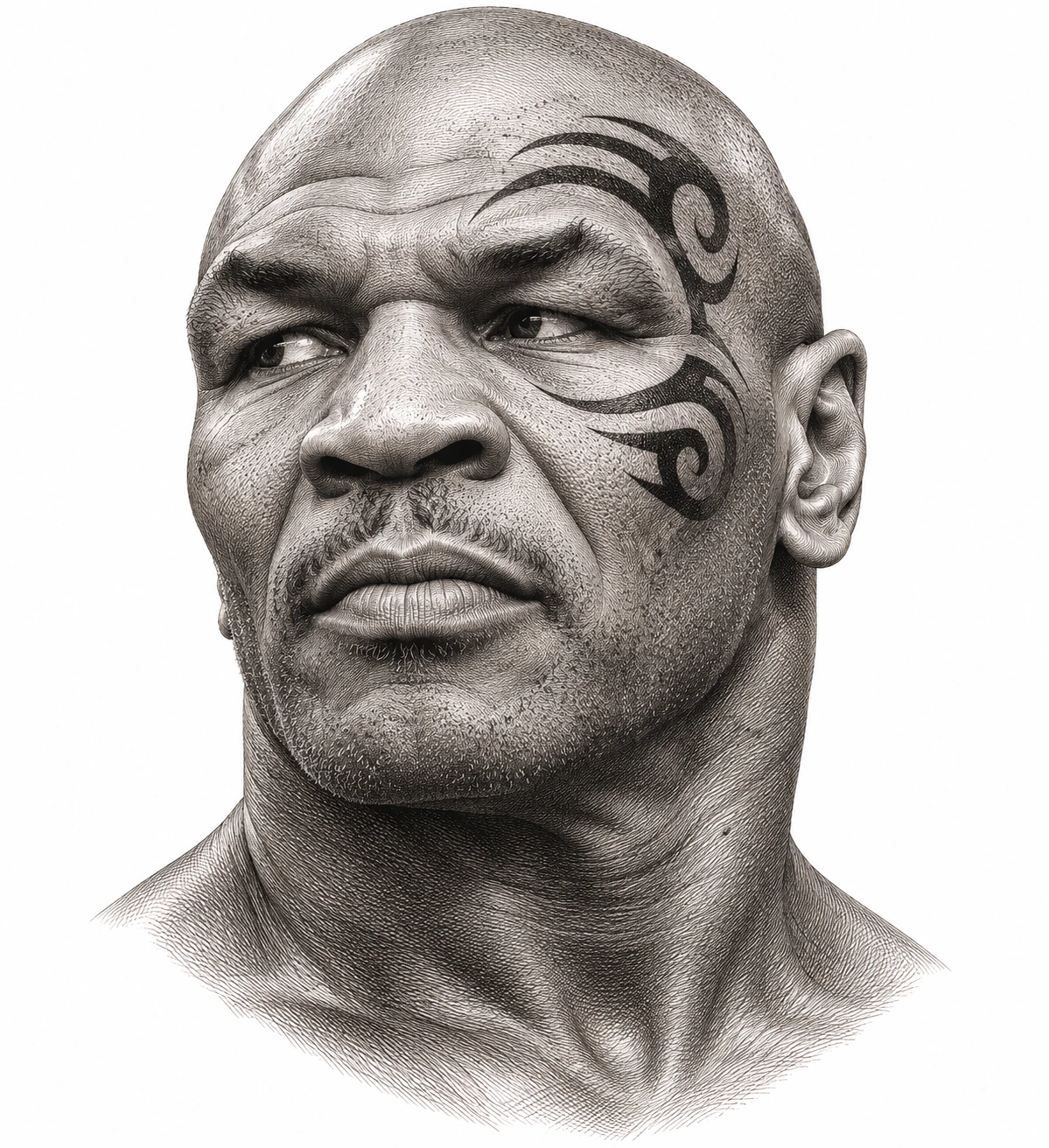
Tattoo History
Mike Tyson Tattoo
The curved black design Victor Whitmill tattooed around Mike Tyson’s left eye in 2003.
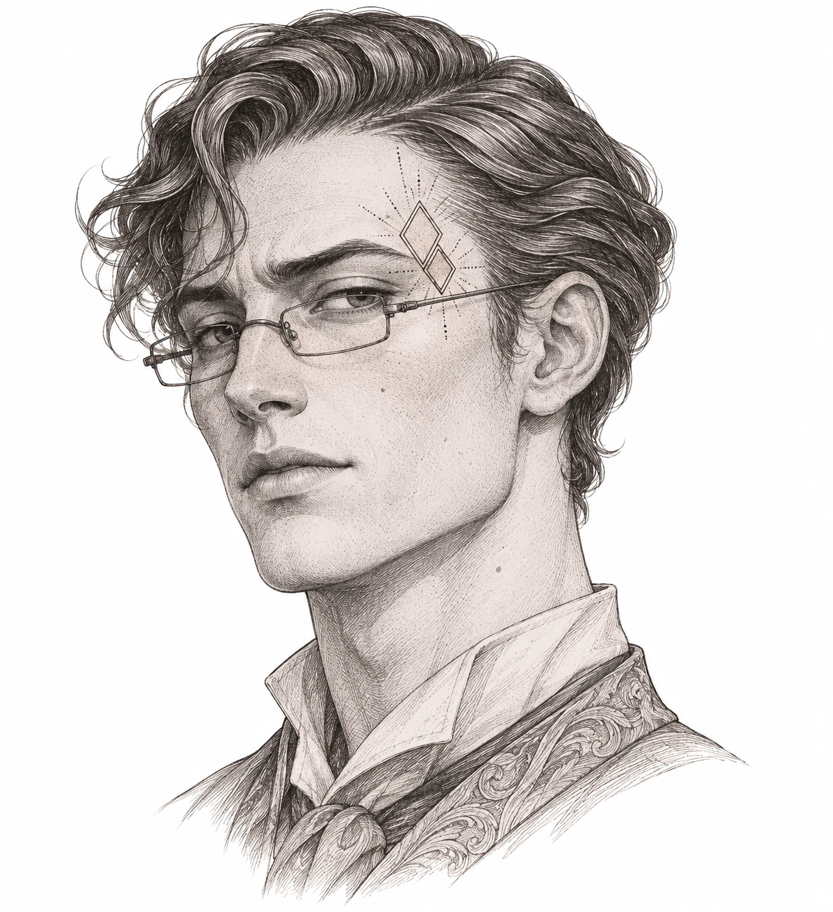
Portrait
Stu Tattoo
A fine-line temple placement study inspired by Stu Price in The Hangover Part II.
Compare ornaments against the features of a profile
A portrait study gives you fixed reference points for an ornamental mark. Use the temple, cheekbone, eyebrow, or frame of the glasses to compare where an edge sits. The anonymous profile is useful for judging a small accent without a well-known reference. The historical and fictional studies have separate source notes that explain what you are looking at.
Consider orientation before you compare the size of the mark. The same shape can sit differently when reversed or shifted relative to an eye or cheekbone. Mark the top edge and facing direction on both prints. Read each artwork page for its attribution and keep the reference separate from any new working drawing.
What to check on a paper proof
On paper, cover the rest of the portrait and check whether the small mark still holds its shape. Uncover the portrait and check that the distance to the nearest facial feature is still clear. A comparison at this stage is about the composition and its references.
When comparing placement references, choose the same landmark on both versions. A copy with glasses gives you the edge of the frame, while the anonymous profile gives you the outer edge of the forehead or nose. Mark the point you are using before changing the paper size. If the accent seems closer to the landmark after scaling, check both the physical gap and the proportions in the original. Use a written note to distinguish a deliberate placement choice from an accidental crop.
Shortlist designs against the space you measured
Choose two or three references from this collection and write down what interests you in each. A compact outline, a long curve, or an open group of marks gives you a more useful comparison than a list of favorites. Measure both the width and height of the area you want to compare. Draw that area on a sheet of plain paper, then place the outline of each reference over it at the same scale. Leave the design in proportion and include any accent that extends beyond the main subject. An element outside the outline can be the part that determines whether the design fits.
Pick the strongest comparison and make one alternate. Try a second print size if the full shape fits but a small gap becomes hard to read. If the overall area is fixed, compare a simplified version at the same size instead. Put a short label under each proof with its width, height, and direction. Change one thing between the versions so you can identify what made the difference. If the copies are for a consultation, bring the original image and the marked proofs together. Those notes let you discuss placement before redrawing the whole design.
Choose the line weight by testing the smallest useful gap
Decide which edges carry the shape before changing the strength of the lines. Look for a gap that has to survive for two forms to stay separate. A larger print gives that opening more room. A reduced version may call for a simpler interior or for moving a small accent away from an important edge. Compare those two options on paper if both are plausible. The preview can help you see what the tool extracted, and a proof shows what remains at the physical size you entered. Use the original reference to check whether a missing line was intentional.
Set up the print and compare the result
When you prepare your own draft, enter the intended width or height and check the other dimension in the preview. Export a sized PDF for a plain-paper comparison. Choose the same paper size in the workspace and printer dialog, then print the calibration sheet at Actual Size or one hundred percent. Measure the reference line with a ruler before comparing the design. If the proof is unexpectedly small, check the printer’s scaling setting first. Changing the image size in the editor would hide the cause and give you a different file to compare later.
For a draft wider or taller than one sheet, line up the repeated marks in the overlap before measuring the full design. Check a small detail that crosses the seam as well as the outside edge. For an asymmetric reference, mark a recognizable feature on the paper and compare it with the original. Confirm how your transfer equipment handles orientation before turning on mirroring. Keep the original reference, the labeled proof, and the final PDF together so you can recover the dimensions you chose when you return to the design.