Motif background
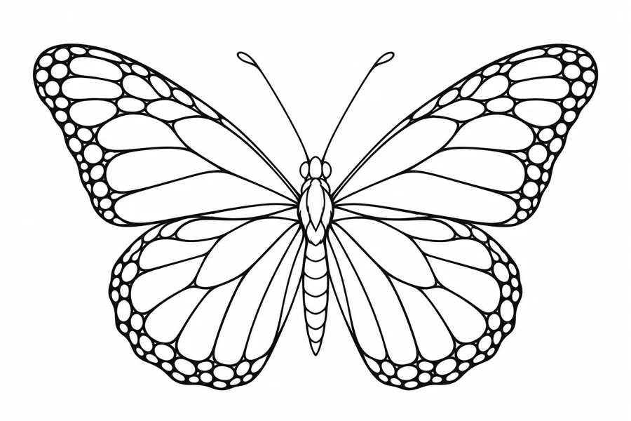
The U.S. Fish and Wildlife Service describes adult monarchs by their orange wings, dark veins, and pale spots around the border. This monochrome design uses the contrast between the wing divisions and rim to suggest that pattern. The species profile is an identification reference. The shape and spacing of the artwork are stylized.
U.S. Fish and Wildlife Service monarch species profile
Placement to compare
Compare an upper arm mockup with a wider shoulder blade mockup. In each, look straight on and note whether both outer rims are visible or one wing disappears around the curve.
Linework and shading to discuss with your artist
Discuss linework for the main veins and possible tone for the border. Point out the light openings you want to preserve so they stay distinct from the dark rim.
Needle grouping terminology from Cheyenne
Compare the monarch pattern with other spread wings
A centered pair of wings makes the monarch a natural starting point when you have room on both sides of a central line. The Blue Morpho has a similarly broad spread but gives more of its area to the outer wing shape, while the Buckeye draws attention to rounded eyespot shapes. Compare the silhouettes at the same span, then decide which interior gives the character you want. If the marked area gets narrower toward one end, also compare where each butterfly reaches its maximum width. A centered body can fit the intended position while the broadest part of a wing still falls outside it.
For a simplified monarch tracing, look for the divisions that organize several nearby wing cells at once. Keeping those boundaries preserves the feeling of a wing with a network of cells even if some short interior marks are left out. Use the outside contour and body as fixed landmarks when comparing both wings. It is easier to tell whether one side looks heavier if you place the two drafts with their bodies aligned and check corresponding areas. You can preserve the overall symmetry without making every smaller mark identical.
Compare the shape at the size you plan to use
Draw a vertical line on the paper and put the monarch’s body on it. Mark the broadest point of each upper wing on the mockup, then check the lower rounded wings separately. On a broad upper-arm comparison, look at the paper straight on and then from the side. If one outer wing moves out of view, try moving the central line before making both wings smaller. That keeps the detailed cells at the same physical size while you compare placement.
A comparison checklist for Monarch Butterfly
- Use the central body to measure the wings on either side of the same axis.
- Check the smallest wing divisions on both wings. Retain enough of the pattern to read without filling every cell.
- Label the upper wings before comparing proofs. Inspect the center and both lower wings after assembly if the print spans sheets.
Fold a spare copy along the body line and compare the shapes that sit near the same point on each wing. Use the fold as a reference, and keep the full proof open beside it to see any intentional difference in the drawing. If a rim cell seems too dense on one side, compare the matching area before making the other side equally dark. An alternate that simplifies both rims can be assessed against the outer wing shapes and the main veins at the same wingspan.
Decide which details belong in the linework
Keep the body and main wing veins clearer than the small cells along the outer edge. Inspect the open spaces where the veins approach the body and the spaces between the rim markings separately. If the outer cells are too tight, remove or merge a few small divisions there rather than thickening every vein. Compare matching regions on both wings afterward so the simpler pattern still looks balanced around the center.
Check the wing shape before the interior pattern. The body and outer contours should remain visible at the proposed size. In a spread-wing design, compare matching areas on both wings. In a profile, identify the overlap that shows which wing is nearest. Keep that boundary readable when reducing the other markings.
Check a plain-paper print at actual size
With the proof printed at Actual Size, line up the body and check a narrow cell beside it on each wing. Then look at the row of cells along both outer rims. If the rim becomes one dark strip while the central divisions still read, test a second version with fewer rim marks at the same wingspan. If the cells near the body also close, compare a larger copy before removing major veins. A change at the rim should not erase the pattern that leads back to the body.
For a tiled proof, keep the body and the start of the principal veins together if possible. Where a joint crosses a wing, check one long vein and a second point on the outer outline in the overlap. Then compare the wing’s distance from the body with the corresponding side. If the body is centered but the rims end at different widths, check paper alignment before redesigning the pattern. Confirm that neither upper tip has been lost in the printer margin. See the actual-size printing guide for calibration and page alignment.
Keep a record of the direction and the chosen draft
Use the body as the vertical reference and label the top of the proof by the broad upper wings. Record the full wingspan and note whether the selected version uses the complete rim or the sparser one. If a small cell was removed on only one side to keep a major vein clear, mark it on the file or paper copy and retain the original pattern beside it. This prevents a reprint or cleanup from treating a deliberate adjustment as a missing part of the stencil.
 Tattoo Stencil
 Buy me a coffee