 Tattoo Stencil
Design notes
The wide silhouette is the main feature. Check the transition between each upper and lower wing.
Artwork source
Vector line art from the Tattoo Stencil collection.
 Buy me a coffee
Butterfly · Tattoo stencil design
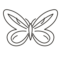
A spread-wing morpho study with broad outer wings and open interior divisions.
The wide silhouette is the main feature. Check the transition between each upper and lower wing.
Vector line art from the Tattoo Stencil collection.
The Smithsonian explains that microscopic structures in the scales of blue morpho wings produce their characteristic blue appearance. This vector reference works in monochrome, using the broad wings and open divisions to carry the shape. The specimen shows where the visual reference comes from, while the sparse interior is a design decision for the artwork.
Smithsonian explanation of blue morpho wing color
Compare a spread-wing mockup across the shoulder blade with one across the outer upper arm. Look for a view where both broad wings and the central join stay visible together.
Discuss keeping the wing panels open in the linework so the artist can evaluate any later tonal or color treatment separately.
This drawing uses a wide upper silhouette and an open band near each wing edge. The rounded lower wings turn back toward the body, which gives them a softer edge than the pointed tails on the Swallowtail. Compare the two studies at the same wingspan. Look for the shape that leaves a comfortable margin on both sides of your paper mockup, then check the body and antennae within that width. The inner band can still read when the small strokes in the wings become faint.
On the smaller proof, look where the inner curves approach the body. If those points close up, try shortening one curve on each side by the same amount. This keeps the bilateral balance while giving the wing roots some air. Place the proofs side by side and follow the lower outline from the body to the widest curve. Preserve that return sweep if you make a simplified tracing. It carries much of the difference between this design and the rounder eyespot studies.
Make a wide paper mockup for an area such as the shoulder or upper back and draw a line through its center. Place the body along that line, then turn the paper slightly and check the two long upper wing edges from the angle you care about. The lower wings sit inside the span of the upper tips, so measure the upper pair first. If both tips fit but look crowded, compare a slightly narrower print and recheck the lower curves separately.
Trace the outside wing shape and the body on a spare sheet, leaving out the bands for this first comparison. Place that outline beside the full draft and follow the movement from the upper tip down to the rounded lower wing. Then add back just one continuous band on each side. Comparing those three versions makes it easier to judge whether the small strokes are doing work that the outer shape and long bands already do. Keep the body fixed when swapping versions.
The short curved marks inside each wing can be edited separately from the sweeping inner band. Inspect the white sliver between a short mark and that band on the upper wing before adjusting stroke weight. If it closes at the scale you are considering, try dropping just the short mark on both sides. Keep the long band and the rounded turn of the lower wing. Compare the simplified copy with the original at the same span so the judgment is about spacing.
Check the wing shape before the interior pattern. The body and outer contours should remain visible at the proposed size. In a spread-wing design, compare matching areas on both wings. In a profile, identify the overlap that shows which wing is nearest. Keep that boundary readable when reducing the other markings.
On the actual-size proof, start at the notch between the upper and lower wing on one side, then look at its counterpart on the other. If one notch reads more strongly, check that the sheet lies flat and that the result appears in the file before editing a symmetrical drawing. Next look just above the lower wing outline for its short curved accent. If both accents print too close to the inner bands, omit the matching pair in a second proof and compare the outline again.
On a wider layout, check whether rotating the page to landscape keeps both broad upper tips in the printable area at the intended span. If you tile an enlarged proof, mark the body axis on the overlap and find a second reference along the sweeping band before joining the sheets. Check the full distance across the upper tips once the pages are together. A small skew near the band can make the spread look uneven even though the body appears to line up. See the actual-size printing guide for calibration and page alignment.
Give the person reviewing the proof the span across the upper pair and the location of the body center on your placement sketch. Mark the long upper tips as the top of the design. The broad outline can look balanced when a thumbnail is turned, so attach an upright reference even if the horizontal direction seems obvious. If you removed a pair of accents, say which wing pair you changed and include the proof that retained the full set of bands for comparison.