Motif background
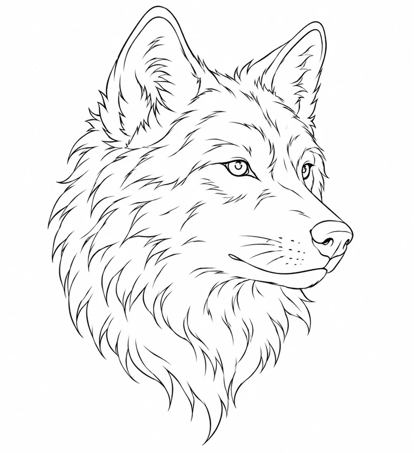
This animal portrait is a stylized three-quarter view. Yellowstone National Park’s wolf ecology page offers photographs and details on the range of gray wolf coat colors. Use that material as a separate wildlife reference when deciding how much texture to keep. In this artwork the muzzle, nearest ear, and brow do most of the work of identifying the head.
Yellowstone National Park on gray wolf ecology
Placement to compare
Compare an upper-arm mockup with a calf mockup at the same scale. Leave some space in the direction the muzzle faces and check whether the widest part of the mane fits the available width.
Linework and shading to discuss with your artist
Ask your artist to separate the contour and eye details from the fur texture. Compare a cleaner line pass around the head with softer shading in the mane, especially where the cheek meets the neck.
Needle grouping terminology from Cheyenne
Choose the amount of fur that serves the profile
A three-quarter head gives you a prominent near ear, a near eye, and a muzzle that projects to one side. The mane widens below those features and then tapers. Compared with the Blackwork Serpent, which keeps a fairly narrow line of movement through its entire height, the wolf needs extra width through the cheek and mane. Put a paper silhouette beside the space you measured and look for room in front of the muzzle. It is easier to compare two placements when the animal has a clear direction to face.
Read the hair as groups that wrap around a form. Along the crown they turn toward the ears, and along the lower head they sweep down into the mane. If you choose to simplify the reference, keep a few grouped strokes that show those changes in direction. Leaving just a little open space around the muzzle can make it feel distinct from the busier neck. Compare a version with a quieter mane beside the original, looking first at whether the face still carries the expression before deciding how much texture to restore.
Compare the shape at the size you plan to use
Mark the near ear, nose, and end of the mane on the back of a paper cutout. These points let you compare the same drawing in a tall calf outline and a wider upper-arm outline without judging fit by the height alone. Check the space beyond the nose when the head is rotated slightly toward either edge. The ear can stay inside the frame while the muzzle runs out of room. Keep enough width below the cheek for the mane to taper at its original angle.
A comparison checklist for Wolf Profile
- Keep the eye and pointed ear inside the same head contour when comparing sizes.
- Separate the fur marks from the cheek outline. Compare one draft with fewer cheek marks at the same physical width.
- Use the nose to mark where the wolf faces on the paper copy.
Compare the head with the mane covered, then uncover the mane and look again at the turn from the lower jaw into the neck. This separates a change in expression from a change in the weight under the head. On a tracing, reduce a few short fur lines under the cheek while keeping the same brow and muzzle. If the head still reads in three-quarter view, check whether restoring one longer strand gives the jaw a cleaner transition than restoring several short strokes.
Decide which details belong in the linework
Use the dark line at the near eye as a reference when deciding how far to lighten the fur marks. A cluster near the brow should suggest the plane above the eye without becoming an extension of the eyelid. On a second draft, remove one group of short brow strokes and leave the lid, nose, and cheek outline in place. Compare that change with simplifying the mane below the jaw. The first edit affects the expression, while the second mainly changes the weight of the neck.
Follow the outside of the head or body first. Keep the feature that makes the animal face a clear direction, such as an eye or a pointed ear. Compare the shape with and without the short interior marks. The version that preserves the direction with fewer marks gives you a useful second proof.
Check a plain-paper print at actual size
Look for two small spaces on paper, the one below the near eye and the one between the lips and the lower edge of the muzzle. If the eye becomes a dark patch while the lips are still clear, mark the brow cluster as the first candidate for simplification. If both areas lose definition, print a second proof at a larger size before erasing individual fur lines. Judge both copies at the same distance and keep the nose pointed in the same direction.
Leave paper beyond the nose and the farthest ear point on the first print so you can distinguish the true outline from a clipped margin. For a larger tiled proof, use the leading edge of the muzzle and a clear line in the lower mane to line up the overlap. If a join crosses the eye, compare that eye against the one-piece reference before editing the brow. A shifted seam can make an intact lid appear doubled or unusually heavy. See the actual-size printing guide for calibration and page alignment.
Keep a record of the direction and the chosen draft
Write the direction of the muzzle on the edge of each proof rather than relying on the angle of the cutout. Mark whether you changed the short strokes at the brow or the longer shapes in the mane. Keep the full profile and the edited detail together when you send them to an artist. A close crop of the near eye can show line spacing, while the complete sheet lets the artist see whether the original expression and the balance of the head still hold.
 Tattoo Stencil
 Buy me a coffee