Motif background
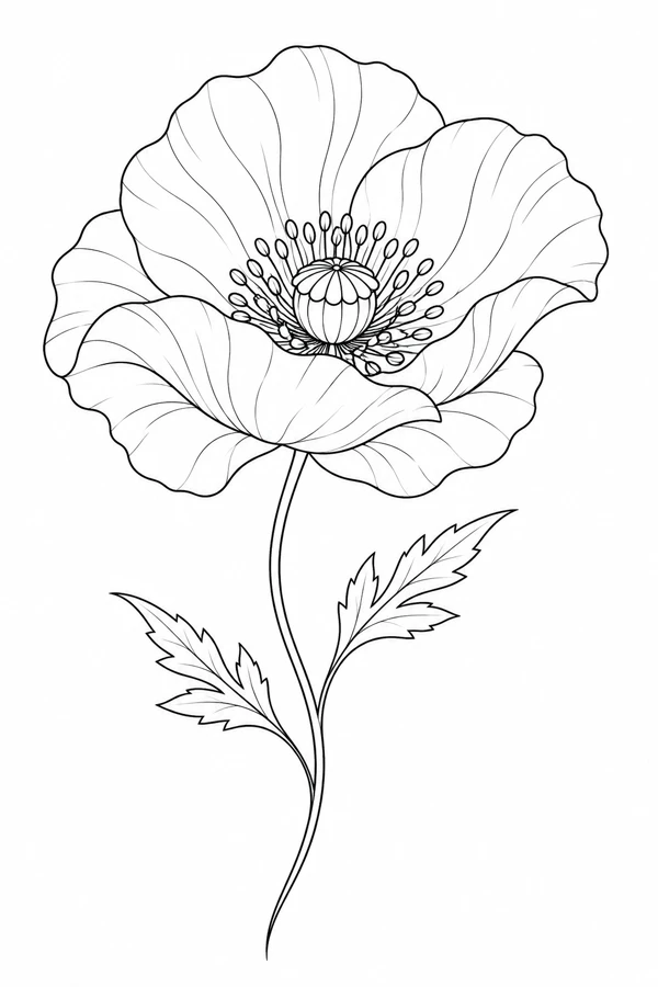
Imperial War Museums documents the poppy’s use as a symbol of remembrance around the First World War and the first poppy appeal in 1921. This botanical study concentrates on the open bloom and seed center. Its source label identifies the digital artwork, while the museum record explains why some viewers may bring a commemorative association to the flower.
Imperial War Museums First World War exhibition guide
Placement to compare
Compare the bloom as a round upper arm mockup with a version along the forearm that keeps the stem visible. The stem shifts the visual weight toward one end.
Linework and shading to discuss with your artist
Ask the artist to separate the petal silhouette from the center’s smaller marks. Decide which folds should remain lines and which could read as tone.
Needle grouping terminology from Cheyenne
Decide how much of the poppy center to keep
The seed center gives this open flower a recognizable focus within the broad petal outline. Compare it with the Minimal Poppy Outline if you are choosing between a flower that reads through a visible interior and one that puts most of its emphasis on the outside silhouette. Compare the same bloom width on both images before looking at their center marks. The difference becomes easier to judge when you can attribute the change to the artwork rather than to scale. On a paper placement sketch, also check where the open bloom ends relative to the nearest edge of the available space.
The outer petal overlaps are a useful second priority if the seed detail needs to be simplified. Keep the boundary around the center and choose a few internal marks that suggest its shape. Then follow the longest petal edge until it passes behind the next petal. Leave that transition visible before adding other folds. This gives you two drafts with the same recognizable poppy structure but different concentrations of detail. They are easier to compare than two versions where both the silhouette and the center have changed.
Compare the shape at the size you plan to use
Mark the widest reach of the open petals and include the full lower curve of the stem in the height. Compare the paper outline with the bloom held near the wider end of an upper-arm or calf mockup. The spread petals determine whether the flower fits while the fine leaves determine how much space the lower section needs. If the bloom fits but the lower leaves project past the marked boundary, turn the tracing slightly before making the center smaller.
A comparison checklist for Open Poppy
- Use the broad petals and seed center as two distinct parts of the silhouette.
- Print an alternate with a simpler seed center. Compare which version still reads as a poppy with the same petal edges.
- Keep the uneven petal overlap as the reference for orientation when comparing a reversed draft.
Compare the proof with the central seed shape covered and then uncovered. The broad petals should still read as an open bloom when the center is out of view. When you uncover it, check whether the ring of marks draws attention inward or turns into a darker patch that hides nearby petal edges. Use a second copy at the same width to try a quieter ring. If the larger outline now reads better, preserve the fuller center in the reference rather than adding the lost detail back everywhere.
Decide which details belong in the linework
Start with the outline of the round seed center and the nearest petal edge. Inspect the pale space between that edge and the ring of small marks around the center. Retain enough of the ring to distinguish it from the broad petals, then try leaving out the shortest repeated marks beside the seed shape. Keep the longer petal lines that lead out from the center at a lighter weight than the outer edge so the fine marks do not divide the open flower into several heavy sections.
Follow the line from the tip of the flower or leaf to the end of the stem. Where petals overlap, decide which edge describes the front petal. If both edges merge in the proof, keep the stronger boundary and try a simpler version of the smaller fold. Leave the outline in proportion.
Check a plain-paper print at actual size
On a plain-paper proof, compare the ring of small marks with the clean edge of the seed center. If the center reads as a solid patch while the broad petals remain clear, the outline can stay at its current width. Prepare a second copy with fewer marks around the seed center and measure the same bloom width on both copies. If the ring remains distinct in the simpler proof, keep the fuller marks on the reference and retain the shorter set in the draft.
Check the longest petal edge and the finest leaves against the PDF margins separately. A clipped leaf tip can be easy to miss when the open flower is intact. If a large paper proof needs a join, try to keep the seed center and the broad petals on a single sheet and use the stem to place the lower part. Check the edge of a neighboring leaf in the overlap as well so a shift in the join does not make the stem look more upright than the artwork. See the actual-size printing guide for calibration and page alignment.
Keep a record of the direction and the chosen draft
Use the most uneven petal overlap to identify the preferred orientation when naming the print. Record the bloom width and the full stem height because a crop around the open flower will change only one of those measurements. Keep both the fuller seed-center reference and the version with fewer short marks. Label the second file with the change so the artist can identify which layer of detail belongs to the linework and which remains available as a reference for a later decision.
 Tattoo Stencil
 Buy me a coffee