Motif background
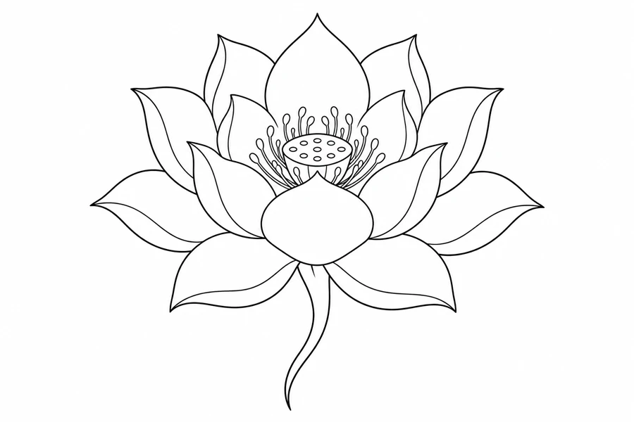
In the Smithsonian’s standing Amida sculpture, the layers of a lotus blossom form the figure’s base. That object shows a specific use of lotus imagery in Buddhist art. The drawing here centers a flower and short stem in a botanical study, with its own arrangement of petal layers.
Smithsonian Amida sculpture on a lotus blossom
Placement to compare
Try a wider mockup on the outer upper arm and a more vertical one along the forearm. On both, check whether the outer petal tips remain visible from the front and where the short stem ends.
Linework and shading to discuss with your artist
Ask the artist whether the lower and upper petal tiers read through contour lines alone or benefit from a tonal distinction. Use the spaces between tips as the comparison points.
Needle grouping terminology from Cheyenne
Check whether the layered lotus fits the space
The lotus spreads from a compact stem into several levels of petals. It makes a useful comparison with the Open Garden Rose, which concentrates its tightest lines around the flower center and gives the stem more of the overall height. If you want the flower to fit across a shallow area, compare where the farthest lotus petals land before judging the inner folds. If you want the motif to occupy a taller space, compare how much of that height the lotus stem actually uses. The difference can help you choose between a broad bloom with a short base and a flower with a longer vertical movement.
A reduced tracing should still show which petal belongs to which layer. Follow one outline from its tip down to where it disappears behind the neighboring form, then check the same relationship in the next row. Adding extra interior marks can make those paths harder to trace with your eye. If you need to keep fewer lines, try preserving a complete boundary on the largest layers and simplifying a short interior fold. Keep the original close so you can see whether the changed tracing still has the stacked character of the lotus.
Compare the shape at the size you plan to use
Measure the width across the two lowest outside petal tips, then check the topmost petal and the end of the curved stem as separate height limits. On a broad paper mockup, put the center on a line and leave room on either side for those lower petals. If the outer tips run out of space while the stem fits, compare a slightly narrower copy at the same center position and inspect how the rows of petals change.
A comparison checklist for Lotus Bloom
- Measure across the outer petals while including the flowing stem in the height.
- Look at the narrow pockets between adjacent petals and keep one clear boundary where two layers nearly meet.
- Use the direction of the short stem to mark the orientation on the proof.
Compare the silhouette with the curved stem covered and then bring the stem back into view. This separates the balance of the petal rows from the direction set by the stem. Trace the outside points of the lower petals on a spare sheet and use those marks to see whether a quieter center changes the sense of depth. If you simplify a fold, keep the location of the outside points fixed on both proofs so the comparison tests the layering rather than a new outline.
Decide which details belong in the linework
Check the pale wedge where a large front petal overlaps the row just behind it. Keep the longer border that establishes the front edge, then decide whether a nearby interior fold adds useful depth. If both marks close the wedge, shorten the fold before reducing the outside petal shape. Leave a little separation around the cluster of small marks behind the front petals so the center reads as a distinct layer rather than a continuation of their edges.
Follow the line from the tip of the flower or leaf to the end of the stem. Where petals overlap, decide which edge describes the front petal. If both edges merge in the proof, keep the stronger boundary and try a simpler version of the smaller fold. Leave the outline in proportion.
Check a plain-paper print at actual size
On the Actual Size proof, follow one petal from its pointed tip to the place where it disappears behind the front row. Try the same check on the matching side. If the rows seem to meet in one long line near the center, print an alternate with one fewer interior fold at that junction. If both versions still make the overlap hard to follow, compare the bloom at a wider setting before dropping a whole petal layer from the tracing.
A wide paper proof can split across the middle of a petal row. If you need to tile it, choose an overlap with an outside petal edge and a second, separated petal tip, then check both against the preview. Avoid judging alignment from a single curved fold near the center. If the stem disappears or a tip falls beyond the paper edge, check the print area before treating the absence as a linework problem. Reprint with the whole silhouette in view before comparing petal depth. See the actual-size printing guide for calibration and page alignment.
Keep a record of the direction and the chosen draft
Mark the stem direction on the proof as the orientation cue because the blossom can look nearly balanced from side to side. Record the width across the bottom petals and whether the stem is included in the printed height. If you removed a fold, note which row and which side changed on the reduced tracing. Share that copy with the original image so the artist can compare the petal layering without trying to infer the intended direction from a symmetrical crop around the bloom.
 Tattoo Stencil
 Buy me a coffee