Motif background
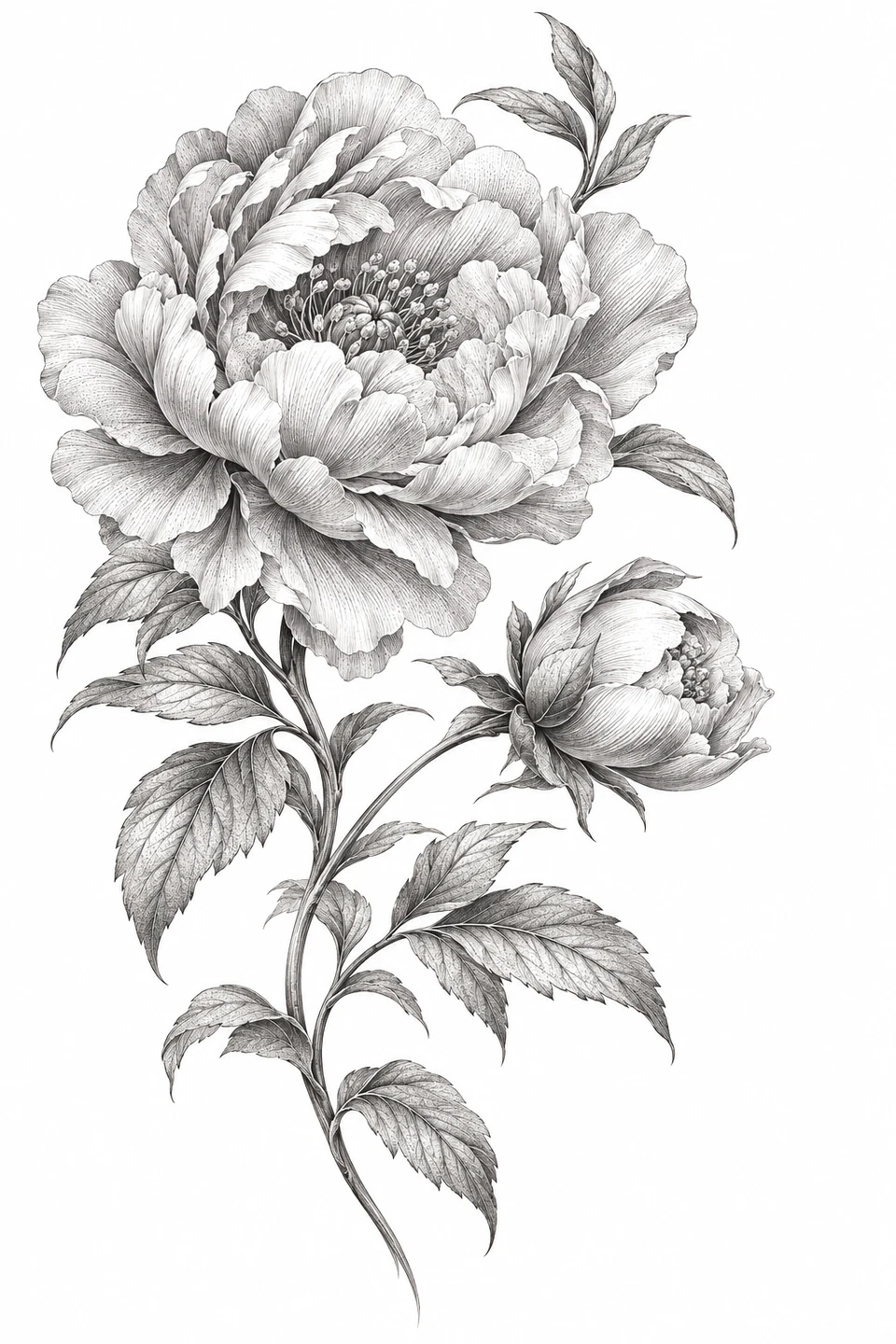
Korean peony painting offers one documented context for the flower motif. The Met describes peonies as a sign of material prosperity in its entry for an early twentieth-century Korean painting. This engraving-style digital study uses its own bloom and leaf arrangement. The museum work is a separate example of the subject in a different medium.
The Met’s Korean peony painting
Placement to compare
Compare an upper arm mockup for the full rounded blossom with a longer forearm layout that gives the stem and smaller bud more room below it.
Linework and shading to discuss with your artist
Show the artist which petal rims you want defined by linework and which printed shadows you would rather discuss as soft shading. The leaf veins can stay on a separate reference for comparison.
Needle grouping terminology from Cheyenne
Separate the peony’s layers from its engraved texture
Choose this peony when a large bloom can be the focus and the bud can act as a quieter counterweight. The Open Garden Rose makes a useful comparison because it also has a broad flower but reads through a pronounced central fold and a cleaner petal arrangement. Compare the two at the same bloom width and then look at the entire silhouette. The peony has more opportunities to distribute visual weight through a petal layer and a leaf edge, while the rose draws the eye toward the tight folds at its center. That difference matters more than an overall count of fine lines.
When tracing the peony, ask what each line explains. A long contour that closes the edge of a petal can make the layer readable even when its shadows are taken out. An engraved line that follows a surface without defining a boundary can stay on the source drawing for the shading discussion. Try tracing the outside of the open bloom and the bud first. Add only the petal transitions that still change which layer appears in front, then compare with the full engraving to see where a missing boundary makes the flower hard to follow.
Compare the shape at the size you plan to use
Use the wide bloom to set the crosswise measurement, then include the lowest leaf and the smaller side bud when checking the outline. On an upper-arm mockup, keep the open flower on the broadest part of the paper and see whether the bud still has space alongside it. For a longer forearm comparison, shift the bloom a little higher on the paper before changing the scale. That tests whether the stem can use the extra length while the petals keep their width.
A comparison checklist for Peony Engraving
- Keep the large bloom, lower stem, and smaller bud visible at once before measuring.
- Compare a petal-edge draft with a fuller draft that includes selected veins. Judge the tight folds separately from soft shading.
- Check which way the open flower leans relative to the bud. Mark that side before choosing the orientation of a proof.
Compare one proof that keeps the petal shadows with another that retains only the edges of the overlapping petals. Cover the bud and lower leaves during the first pass so the large flower has to explain its depth on its own. Then uncover the rest and see whether the side bud still reads as a separate part of the plant. Mark the darkest fold that changed between the two copies. That tells you whether to keep an interior line in the tracing or leave that information in the engraved reference.
Decide which details belong in the linework
At the narrow fold where two petals touch, try using one clear petal edge and leaving the short engraving marks beside it on the tonal reference. Compare the separation between a leaf vein and the leaf edge as a second check. If those lines nearly meet, simplify the shortest vein before weakening the outline of the leaf. The boundary that shows which petal sits in front does more work in the tracing than the small strokes that only darken the petal surface.
Follow the line from the tip of the flower or leaf to the end of the stem. Where petals overlap, decide which edge describes the front petal. If both edges merge in the proof, keep the stronger boundary and try a simpler version of the smaller fold. Leave the outline in proportion.
Check a plain-paper print at actual size
After printing at Actual Size, examine the pale openings immediately below the open bloom and around the smaller bud. If the bud looks like part of a neighboring leaf, first confirm that the PDF calibration line measured correctly. Compare a second tracing that removes one local shadow line while keeping the bud silhouette at the same width. If it still reads as a single patch, give that junction more space and compare a new proof before simplifying the rest of the flower.
Try to keep the flower’s center and its broad outside petals on one sheet. If a wider proof must be tiled, check the angle of the lower stem and the edge of a large leaf at the overlap. Fine engraving marks may seem to connect even when the larger shapes are out of register. If a narrow bud is cut off but the flower still fits at the intended width, check the layout margins first. A position change may keep the bud without shrinking the folds you are trying to evaluate. See the actual-size printing guide for calibration and page alignment.
Keep a record of the direction and the chosen draft
Use the smaller bud to identify the chosen direction on the handoff, and write down which way it sits beside the open blossom. Save the fuller engraving and the reduced outline with different names, keeping the bloom width and overall height with the print file. If the leaf veins or interior hatching were reduced, circle the relevant area on a proof rather than describing every stroke in a note. The artist can then compare the decision with the shading in the original image.
 Tattoo Stencil
 Buy me a coffee