Motif background
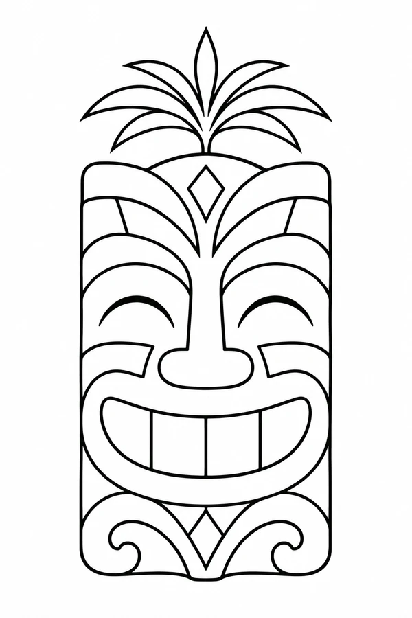
This contemporary decorative face combines a block-shaped smile with a palm frond. The Smithsonian’s collection of American tiki serving ware includes tropical plant and fruit forms alongside faces. That design context helps explain why the palm and face read as a paired motif here. The specific smile and frond belong to this invented illustration.
Smithsonian collection of American tiki glasses
Placement to compare
Try a tapered upper-arm mockup with the frond pointing into the narrowing space and the smile in the wider area. Keep paper around the outer leaf tips before comparing the silhouette from either side.
Linework and shading to discuss with your artist
Ask how the artist would separate the lighter frond lines from the outline around the mouth. On the proof, compare open tooth divisions with a heavier black border so both parts retain their character.
Needle grouping terminology from Cheyenne
Leave a little sky around the fronds
The palm gives the blocky face an open top. Its upward blades and the squared teeth create two different rhythms, one pointed and one deliberately even. The Mask fills nearly the whole top with a geometric crown, while the Palm Face leaves white space around a narrow central stem. If you are choosing a paper reference for a tall, tapered area, compare where each top would fall. The palm can sit inside a narrowing space above the face while the block below still needs enough room for the broad smile.
Try viewing the design with the teeth and fronds separately covered by scraps of paper. That reveals which pattern is doing the work at the distance where you expect to see the piece. If the leaf pattern catches your eye first and holds it there, consider using fewer interior marks in the palm while keeping its outer sweep. If the teeth dominate, keep their outside edge and compare a lighter set of divisions. That gives you two ways to rebalance the face without shortening the leaf silhouette or narrowing the smile.
Compare the shape at the size you plan to use
Start the paper mockup by drawing a horizontal mark under the grin and another where the palm first clears the crown. This lets you test how much of a long placement is taken up by the face and how much is left for the fronds. On a tapered outline, compare a centered arrangement with one in which the lower block sits slightly to the wider side. Watch the endpoints of the outer fronds as you move the copy. They can reach farther across than the stem suggests.
A comparison checklist for Tiki-Inspired Palm Face
- Use the palm tip to measure total height, and use the face to check the widest part of the design.
- Compare a draft with simpler frond marks at the point where the palm meets the face.
- Mark the frond’s lean on the proof before comparing the opposite direction.
Make one tracing with the palm intact and another that leaves out a short line from inside a frond. Put the tracings over the same copy of the face. Look at whether the simplified leaf still has a distinct endpoint and whether the stem remains separate from the top ornament. Then compare the grin in both copies. If the smile seems narrower even though you never edited it, the altered palm may have changed the balance of the whole composition.
Decide which details belong in the linework
The narrowest fronds turn inward above the small diamond at the top of the face. Keep a clean interval there so the palm does not appear to grow out of a single dark patch. The tooth divisions present a different problem because they run across a wider, regular space. Preserve the outside of the grin and try a lighter divider inside it. If another detail needs to go, remove one interior stroke from a frond rather than weakening the profile of the leaf.
Look at the balance between the eyes, mouth, and larger border before evaluating the short geometric marks. Keep the spacing around the face consistent in a simplified study. Compare a separate copy with fewer internal divisions if the face loses its expression on the smaller proof.
Check a plain-paper print at actual size
Print the face at your chosen size and look at the diamond beneath the palm before judging the smile. If the diamond becomes a filled mark but the wider tooth gaps remain visible, circle that junction on the proof. Compare a second version with a cleaner diamond or fewer nearby divisions at the same physical size. Then put the two copies at arm’s length and check that the palm and crown still read as separate elements. Keep the wider face fixed while you compare the top.
Check the sheet preview from the lowest edge of the face to the highest palm tip. The thin tip can be clipped even when the heavier face looks complete in the print preview. On a tiled proof, avoid putting a seam through the diamond beneath the palm where you can. If that point does land in the overlap, align the adjacent long edges of the crown first, then inspect the meeting of the stem and the diamond on the assembled copy. See the actual-size printing guide for calibration and page alignment.
Keep a record of the direction and the chosen draft
Put an upward arrow beside the palm stem on the margin of the proof and write down the total height including the tallest frond. Keep that measurement separate from the width across the lower face. When comparing alternate fronds, label the leaf you changed and keep the same face under it. If you share a narrow crop of the crown for review, include a second image of the whole design so the recipient can judge the palm against the grin.
 Tattoo Stencil
 Buy me a coffee