Motif background
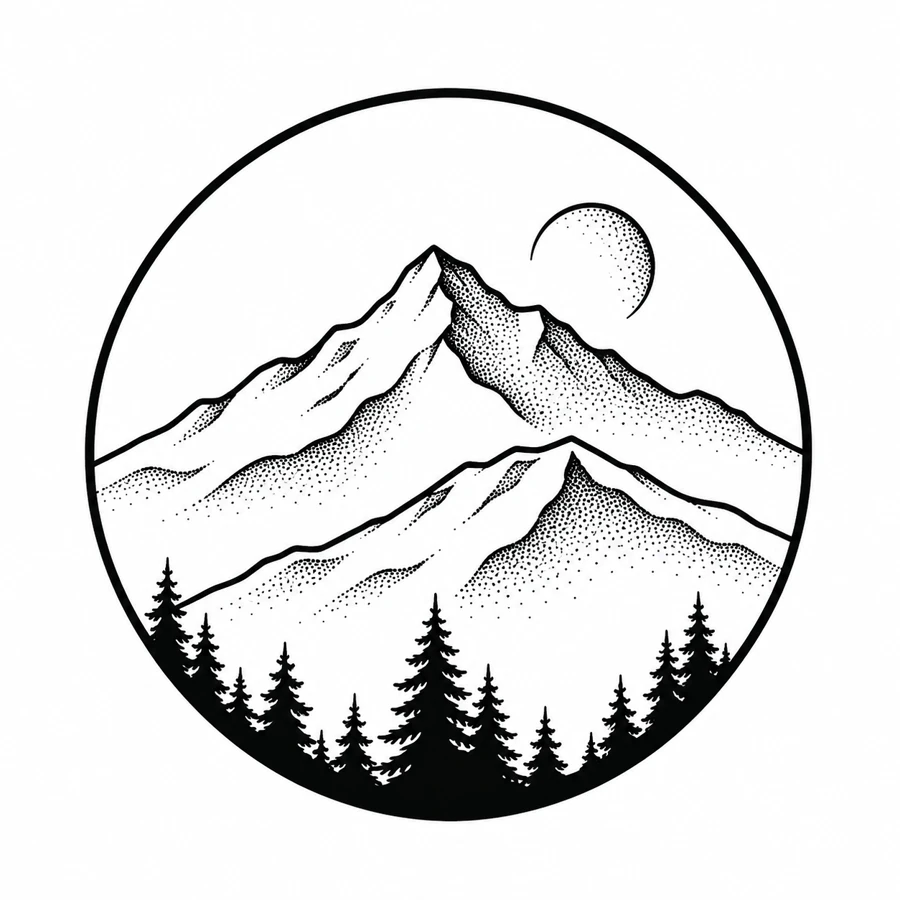
The mountain circle is a composite landscape built from several ridges, conifers, and a moon. Its dots echo the visual principle of stipple engraving, a printmaking method that uses dots to create tone. The museum essay explains that printmaking background. The dotted sky in this illustration helps separate the lighter space above the mountains from the dark tree line.
The Met on stipple and other intaglio printing techniques
Placement to compare
Try the full disk on an upper-arm or calf mockup. Mark the horizon and see how the ring reads from the intended viewing angle before deciding whether to reduce the diameter.
Linework and shading to discuss with your artist
Ask the artist to separate the crisp ridgeline and ring from the softer dot shading in the sky. Keep the small space at the moon edge open when comparing how much texture to carry into the final drawing.
Needle grouping terminology from Cheyenne
Keep the sky distinct from the mountain layers
The circle contains three kinds of shape. A pale moon occupies the upper sky, angular ridges cross the middle, and the dark conifers weight the bottom. Compare the Crescent Orbit if you want a lighter sky reference with room to spread outside its main shape. Here the circular border holds the landscape together and gives the trees a shared base. Place the whole disk in a paper layout before deciding whether the surrounding space can carry a circular design of that diameter.
Try looking at the scene in layers. The foreground trees can read as a single dark band from across the room, while the change from one ridge to another depends on thin contours and different textures. A cleaner study can keep the strongest ridge outlines and the upper moon with less stipple on the slopes. Compare that version beside the full illustration to see if the sense of distance still comes through. Keep the arc around the sky when judging the result, since it shows how the moon sits in relation to the whole scene.
Compare the shape at the size you plan to use
Trace the full circle and mark the highest peak and the moon before placing the copy on a calf or upper-arm outline. View the mockup from the front and at an angle and see whether the rim, rather than the mountain, is what runs short of space. Compare a slightly smaller disk before cropping the trees at the base. The circle is the common frame for the peak, moon, and treeline. Keep it visible when comparing how much room each layer gets at a different diameter.
A comparison checklist for Dotwork Alpine Moon
- Measure the diameter of the whole composition before cropping around the ridges.
- Check where the dots approach the moon and where the ridgelines cross behind one another. Keep those boundaries readable before adding texture.
- Mark the location of the moon relative to the highest point so the paper study keeps the intended direction.
Make one overlay of the moon, highest peak, and outside rim. On another, trace where the two main ridges meet the dark trees. Stack the overlays and see which parts of the scene still read without the dotted texture. Compare a draft with fewer marks in the sky to one where you simplified the near slope. Those two edits leave different amounts of open space around the moon. Keep the rim the same so you can judge the landscape inside it.
Decide which details belong in the linework
Compare the near ridge and the one behind it where both shapes meet near the middle of the disk. Use the strongest edge for the nearer ridge and try fewer stipple marks in the area above the farther ridge. At the bottom, keep the outline of several tree tips even if the rest of the forest reads as a dark base. Avoid restoring tiny marks around the moon until the space between its lit edge and the mountain contour remains clear on the proof.
Inspect the smallest group of dots next to a solid outline. Decide whether individual marks are needed in the stencil or whether the original can carry part of the tonal reference. Compare a proof with fewer dots to the full version at the same size. Keep an open margin around the main edge.
Check a plain-paper print at actual size
On the sized proof, check the narrow pale area beside the moon, then follow the two strongest ridgelines down to the trees. If the moon is still distinct but both slopes appear to join, compare a second copy with less stipple at the ridge junction. If the rim and tree tops also blur together, test a larger circle before removing the foreground layer. Keep the moon position and peak height fixed when comparing the edited proof so you can judge the change in texture on its own.
Check the full circle against the page margins before cutting out the disk. A clipped edge can make a correct print look oval or move the apparent center of the landscape. If the print is larger than one sheet, align a clean section of the rim and a ridgeline where both appear in the overlap. After assembly, check the sky beside the moon for an abrupt break before deciding whether the stipple or the mountain contour needs an edit. See the actual-size printing guide for calibration and page alignment.
Keep a record of the direction and the chosen draft
Mark where the moon sits relative to the highest peak and identify the bottom edge with the trees on the chosen proof. Include the diameter when you pass the draft to someone else. If you made a lighter sky or simplified a ridge, label which layer changed so the edit is clear even in a small preview. Share the full disk along with any crop of the moon. The complete view preserves the amount of dark foreground against the open sky.
 Tattoo Stencil
 Buy me a coffee