Motif background
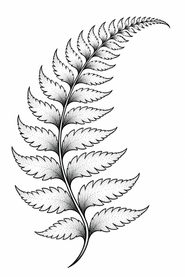
The Forest Service’s guide to ferns describes the central shaft of a divided frond and the leaflets that branch from it. The stem and repeated leaflets give this illustration its identifiable structure. The stipple near their bases is a tonal choice that emphasizes the curve through the frond.
USDA Forest Service guide to fern structure
Placement to compare
Try aligning the frond along a forearm mockup and compare where the taper falls if the tip points the other way. Include the widest lower leaflets in the cutout before deciding which direction leaves more room around the curved tip.
Linework and shading to discuss with your artist
Ask the artist to compare a continuous stem line with a lighter dot treatment inside the leaflets. A paper proof can show where the dots crowd the leaf edge and where the outline already communicates the shape.
Needle grouping terminology from Cheyenne
Let the stem set the rhythm of the leaflets
The stem follows a long curve that lifts toward the tip. Larger leaflets open out near the base, then get smaller and closer together near the top. Unlike the paired flower heads and dark cutouts of the Blackwork Thistle, this design offers a single continuous path through lighter foliage. A narrow placement sketch can follow the stem, but leave room on the side toward which the tip bends. The lean of the fern is part of the silhouette even when its dotted texture is subtle.
Compare the lower and upper leaflets separately when deciding how much of the design to simplify. The larger leaves can carry a few interior marks without losing their serrated edges. Near the tip, the diminishing outlines already suggest growth, so a sparse texture may describe them more clearly. To judge the overall gesture, view the fern as a clean outline beside the textured version. That comparison lets you decide where the dots genuinely describe a turn in a leaf and where the edge already makes the shape clear.
Compare the shape at the size you plan to use
Follow the frond with a strip of tracing paper and place a mark beside the widest lower leaflet and another beside the final curve at the tip. Move the tracing along a forearm outline at the same scale to see where those points fall on the wider and narrower parts of the mockup. Check whether the tip still has room to turn. If it approaches the boundary, compare a shorter print with the complete taper before cropping off the smallest group of leaflets.
A comparison checklist for Dotwork Fern
- Follow the stem from end to tip and include the longest leaflet in the measured width.
- Compare the stipple near the base of a leaflet with the clear space outside it. Keep both areas distinct on the smaller proof.
- Mark the lean of the stem before reversing the paper mockup.
Trace the central stem and the longest lower leaflets on one overlay. On another, add just the dots closest to a middle leaflet joint. Compare the rhythm of the taper before bringing back the rest of the texture. If the little tips look less distinct in the fuller version, check which dots pull your eye toward the center and away from the outside edge. Keep the main curve and the difference between large and small leaflets in both drafts.
Decide which details belong in the linework
Compare a serrated leaflet halfway up the fern with one of the much smaller shapes at the tip. The middle leaflet has room for a thin edge and a dotted interior, while the smaller leaflet may be legible from the edge alone. Try removing the dots nearest the top on one draft while keeping the outline and the central stem intact. On another draft, lighten the denser marks where a middle leaflet joins the stem. Compare those two decisions independently so the taper remains recognizable.
Inspect the smallest group of dots next to a solid outline. Decide whether individual marks are needed in the stencil or whether the original can carry part of the tonal reference. Compare a proof with fewer dots to the full version at the same size. Keep an open margin around the main edge.
Check a plain-paper print at actual size
Circle a pair of dots on one mid-sized leaflet and check whether a pale space remains between the marks on the sized proof. Then check the gap between the tip of that leaflet and the adjacent outline. If dots merge while both outlines still separate, compare the same proof with lighter stipple at the join. If the outlines merge too, print a slightly larger frond before simplifying the serrations. Keep the comparison at the same orientation so the two copies show the same side of the curve.
Keep the farthest leaf tips visible inside the printable area before cutting out a single-sheet proof. If a long version requires assembly, line up the repeated part of the main stem and one fully outlined leaflet before comparing the dots across the join. A small stagger can turn two separate marks into one cluster on the assembled copy. Trace the stem through the seam with your eye before thinning a dense patch, and compare its full length with the size you set. See the actual-size printing guide for calibration and page alignment.
Keep a record of the direction and the chosen draft
Mark the direction of the frond tip and the side with the longest lower leaflet on your chosen proof. Record where you reduced the dot texture, such as the leaflet joints or the smallest pair near the tip. Keep the outline copy and the textured draft separate so they are easy to compare at the same scale. When sharing the proof, include its full length along with any enlarged detail that shows the gap between a dot and the next leaflet outline.
 Tattoo Stencil
 Buy me a coffee