Motif background
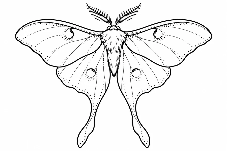
University of Florida entomologists identify the adult luna moth by features that include long hindwing tails and eyespots on both wing pairs. The drawing keeps those features, using stipple to suggest wing tone. The pale outline and dots are the illustration’s interpretation of the animal.
University of Florida account of luna moth anatomy
Placement to compare
Compare the same wing span on a broad upper-arm mockup and an upper-back layout. Leave room below the moth for both tails and check that they stay separate when the cutout is viewed from an angle.
Linework and shading to discuss with your artist
Ask about a lighter dot treatment inside the wings so the eyespots, antennae, and outline retain their own weight. Check whether the smallest dots near the wings can be spaced farther apart before simplifying the tail shape.
Needle grouping terminology from Cheyenne
Balance the wide wings with the long lower tails
The upper wings spread in a shallow arc, and the hindwing tails make the lower half of the figure extend much farther down. Small outlined spots and stippled panels keep the wings lighter than the densely ornamented Death’s-Head Moth. If you are choosing between them, put both silhouettes into the measured area before comparing details. The luna moth needs room under the body for both tails, while the Death’s-Head design uses some of that space for surrounding ornament.
When comparing two renderings of the luna moth, view the tail edges and the feathery antennae together. Those parts give the outline a taper above and below the wing span. You can retain that silhouette while comparing fewer interior marks around the eyespots or lighter stipple in one area. Near another motif, check how much open space remains between each tail and the next shape. Keeping that space visible helps the long tips look intentional instead of appearing to run into the neighboring linework.
Compare the shape at the size you plan to use
Mark the wing tips, ends of the tails, and highest antenna on a paper copy before trying it on an upper-arm or upper-back outline. Keep the body upright while you move the copy. The wings can fit from side to side while the tails extend beyond the available area below, so check height after setting the wingspan. Compare a second size with both tails present and view each from the intended angle. A centered body helps make it clear which side is losing space.
A comparison checklist for Dotwork Luna Moth
- Set the wingspan and keep the left and right outlines around the body at equal scale.
- Compare the dotted marks closest to the outer wing and keep a visible band of space between them and the outline.
- Label the upper side of the proof using the body rather than the orientation of the sheet.
Lay one tracing over the left wing and a second over the right, using the body as the point they share. Mark a matching eyespot on both so you can compare how the dots sit around it. Then cover the spots and compare the two tails. If a simpler wing still looks balanced, leave its spot border fixed while changing the neighboring texture. The tails and spot outlines carry different parts of the moth’s shape, so judge them independently.
Decide which details belong in the linework
Check the outlines around the eyespots and the narrow connections between the lower wings and tails. Those lines help identify the moth even if some interior texture is lighter. Try simplifying one field of dots next to a spot, while keeping the spot border and the vein that leads toward it. The short lines in the antennae are a different texture. Compare keeping just the shape of the antenna before taking more detail out of the tails or thickening every outline.
Inspect the smallest group of dots next to a solid outline. Decide whether individual marks are needed in the stencil or whether the original can carry part of the tonal reference. Compare a proof with fewer dots to the full version at the same size. Keep an open margin around the main edge.
Check a plain-paper print at actual size
At actual size, compare the spots on the two upper wings first, then follow the two tails down from the body. If the dots gather into a gray patch while the spot outline remains intact, compare a sparser interior at the same wingspan. If either tail loses its narrow edge too, compare a larger proof before changing both features. View the two copies side by side, using the body and upper wings as landmarks to make sure both proofs are facing the same way.
Check the antennae at the top and the narrow tail tips at the bottom before trimming the printed outline. If the wings require tiled pages, line up the long edge of a wing and the spot outline where the PDF shows them in the overlap. Avoid using a loose patch of stipple as the only alignment guide. Once the sheets are joined, compare the wing tips across the body and make sure both tails remain their intended length. See the actual-size printing guide for calibration and page alignment.
Keep a record of the direction and the chosen draft
Mark the top above the antennae and note which wing you simplified on the selected proof. Record the wingspan and check the overall height as well, since an edit near the tails might change how the draft fits. If you removed texture around one eyespot first, keep that trial separate from the version with a matching edit on both wings. Share the whole moth with any crop so the balance of the two wings and the position of the tails stay visible.
 Tattoo Stencil
 Buy me a coffee