Motif background
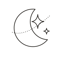
This vector combines a crescent shape with two outlined stars and an interrupted dotted curve. NASA’s phase guide explains that a crescent is the portion of the sunlit lunar surface visible from Earth at certain points in the cycle. The spacing of the stars and arc belongs to the illustration’s composition.
NASA’s guide to Moon phases
Placement to compare
Compare a horizontal mockup along the collarbone with a diagonal mockup on the outer forearm. Keep the farthest star in the cutout so its full footprint stays visible when you rotate the design.
Linework and shading to discuss with your artist
Ask the artist to compare a continuous liner curve on the crescent with individually spaced dots along the arc. Check the empty space between the nearest star and the moon before refining the star outlines.
Needle grouping terminology from Cheyenne
Treat the gaps as part of the design
The crescent occupies the left side and opens toward two outlined stars. A dotted curve threads through the wider composition, so the shape feels more like a sweep across the page than a disk. Compare the Dotwork Alpine Moon if you want the sky and ground enclosed inside one circle. The Crescent Orbit leaves its small accents in open space, which can work beside another piece of linework when you can reserve room around the dots and the star tips.
Decide where you want a viewer to look first. The long curved outline naturally leads the eye, while the larger star gives that movement a destination. If you shift an accent to make the design fit a narrow layout, compare the result with the original to see whether the small star still leads away from the larger one. The open interior of the crescent is worth preserving as you test different arrangements. Once that space crowds around the nearest points, the arc and stars start to feel like ornament packed inside the moon.
Compare the shape at the size you plan to use
Place the SVG on a paper strip long enough to show the dots at the far end of the orbit, then pencil the limits of the strip around the entire design. Compare a level collarbone mockup with the same strip turned diagonally along a forearm sketch. In each position check the room past the smaller star and around the lower point of the moon. Moving the strip without changing its scale shows whether the open end of the composition needs more room than the moon itself.
A comparison checklist for Crescent Orbit
- Measure across the stars and dotted arc as well as the crescent, because they set the full footprint.
- Look at the nearest star to the crescent and the spacing between two orbit dots on the smaller copy.
- Mark which way the crescent opens. Compare the opposite direction with the same distance between the stars and the moon.
Make one overlay with the crescent alone and a second with the stars and dotted arc. Compare what each version does with the empty space inside the curve. Move the overlay until you can judge the gap between the smaller star and the nearest dots without shifting the moon itself. If those two marks compete, adjust one before rearranging the rest of the orbit. A draft that keeps a pause between them can still show the direction of the arc.
Decide which details belong in the linework
The moon and both stars use a continuous vector stroke, while the dash pattern turns another curve into isolated marks. At a smaller scale, inspect the two inward corners on the smaller star and compare them with the empty space between orbit dots. Increasing every stroke at once can close the corners while making the dots look more solid. Keep the moon contour and try simplifying a point or moving an accent slightly farther from the curve on a separate draft.
Mark the central axis or point of symmetry in your notes before measuring. Look at the smallest repeating interval in the design. If rings, rays, or arcs nearly touch, compare the same interval at opposite sides of the proof. Keep the spacing consistent when simplifying a repeated element.
Check a plain-paper print at actual size
After checking the calibration mark, follow the dotted path from the lower left toward the far end and note where any two marks appear to join. Separately check whether the small star still has four recognizable points. If only the dots run together, compare a proof with fewer dots at the same width. If the star has also lost its points, compare a larger proof before thickening the contours. Keep the crescent and both stars in view as you judge the result.
Fit the entire dotted path inside the printable area, including the far end where a small dot can disappear close to the margin. If an enlarged version spans pages, avoid placing a join between two dots without another mark nearby for alignment. Where the overlap reaches the crescent, align its longer curve first, then count the orbit marks across the join. Compare that count to the PDF before deciding whether a missing dot was lost during printing or left out of the design. See the actual-size printing guide for calibration and page alignment.
Keep a record of the direction and the chosen draft
Mark which way the crescent opens and where the orbit ends on the final proof. Those two notes make it easier to distinguish a reversed layout from a draft where you moved only one star. If you compare a collarbone layout with a diagonal version, keep the star distances the same and label the two positions separately. Keep the full vector artwork beside the paper mockup so the direction of the arc remains visible when someone views a close crop.
 Tattoo Stencil
 Buy me a coffee