Motif background
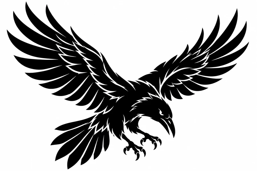
Cornell’s field guide describes the common raven’s heavy bill and wedge-shaped tail in flight. Those features give useful points of comparison with this deliberately dramatic, head-down silhouette. The pale slits through the dark wings are a graphic choice that helps the viewer follow the feather groups.
Cornell Lab of Ornithology’s common raven identification guide
Placement to compare
Compare the full wingspan across an upper-back mockup and across a smaller shoulder sketch. Leave some space past the longest wing tips and mark the point of the beak to judge how the composition reads as the paper turns.
Linework and shading to discuss with your artist
Ask your artist to compare broad black packing with the longer gaps reserved between feather groups. The shape should carry its motion at a glance, so evaluate the wing openings before adding short interior accents.
Needle grouping terminology from Cheyenne
Give the outstretched wings the space they need
The wings pull outward and up while the head, feet, and tail keep the pose pointed downward. The longest pale feather separations divide each dark wing into layered groups. Compared with the long Blackwork Serpent, this image takes up far more width for the same height. Compare the full wing outline on a broad paper mockup before trimming the side margins. Leaving a little air past both tips keeps the wingspan readable beside another dark design.
When comparing a simplified drawing with the fuller illustration, look at the two wings from the outside inward. A few long openings can preserve the shape of the feather groups while shorter pale accents provide texture near the body. If you want the diving pose to lead, keep the clear outline around the beak and feet even if you simplify some of those accents. A smaller layout that keeps the entire bird may read better than a larger layout with one wing clipped, since the wing tips set the span of the gesture.
Compare the shape at the size you plan to use
Mark the highest wing tip on each side and the point of the beak on a broad paper cutout. Fit those three points into an upper-back outline, then try the same cutout over a narrower shoulder sketch. Look at the space above the tips and where the body points when one wing wraps toward the edge. Compare a smaller full-width version with the larger copy before trimming any part of the wing. The feet and tail give you a second check on the vertical room below the beak.
A comparison checklist for Blackwork Raven
- Use the outer wing tips and the head to trace the diving direction.
- Compare the white breaks between feathers in the lower wing. Keep the longest separations if a small break closes.
- Mark the direction of the beak on both proofs so you can compare the silhouette without accidentally reversing it.
Start with two overlays of the wings. On one, trace the long breaks that separate large feather groups. On the other, keep those breaks and add the smaller marks near the body. Align both to the beak and compare where your eye follows each wing. Then cover the feet briefly and see whether the diving pose still reads from the wings alone. The wing cuts and toe gaps carry different information, so make a separate decision about each area.
Decide which details belong in the linework
Compare the long pale cuts that run between feather groups with the short accents closer to the body. Keep the cuts that describe the direction of the leading wing edges first. If a small accent appears to split a feather into two unrelated shapes, leave it out on a separate draft. Do the same exercise around the feet only after the wing treatment reads clearly. The spaces between the toes and between the feathers serve different parts of the silhouette and can be simplified separately.
Look at each light opening inside the dark silhouette. The openings separate feathers, leaves, or bands that would otherwise read as one shape. Keep the biggest separations when preparing a reduced proof. A smaller opening can be widened in a working draft and compared against the original at the same size.
Check a plain-paper print at actual size
Read the sized paper proof from wing tip to shoulder on each side and mark the first place a pale opening drops out. Then look below the head and see whether the feet still separate from the body. If the short marks are the only ones lost, compare a cleaner version that keeps the long feather groups. If the longest cuts close as well, try a wider print before editing the wings. Use the point of the beak to align both copies when comparing the diving pose.
Check the tallest wing tips and the lowest points around the feet before trimming a single-sheet proof. For a larger print, try keeping the beak and near shoulder off a seam. Where the overlap crosses a wing, match a long pale cut and the nearby outside edge before comparing the short feather openings. An offset along the solid black area can hide at first glance, so follow the same feather break across the join and compare it to the PDF before adjusting the drawing. See the actual-size printing guide for calibration and page alignment.
Keep a record of the direction and the chosen draft
Use the beak and the topmost wing tip as direction marks when labeling the chosen proof. A comparison that reverses the bird changes where both points land in the placement outline. If you dropped small feather accents or opened a gap around the feet, record those choices separately. Send a full silhouette as well as any crop of the changed openings. The full view gives the reviewer enough context to judge how the edit affects the direction and balance of the dive.
 Tattoo Stencil
 Buy me a coffee